FLEXI-11: Homepage "discover something new" pop-up site fade
Solved by Mike Burgess
FLEXI-85: Quote me mobile brings up keyboard
Solution
From Stack Overflow, "By setting the input field to readonly="true" you should prevent anyone typing anything in it, but still be able to launch a click event on it."
Old code
<input type="text" name="0bcd2966-cb97-47ec-dfd5-6801ef1dc4df"
id="0bcd2966-cb97-47ec-dfd5-6801ef1dc4df" class="daterangepickerfield"
value="" data-val="true"
data-val-required="Please provide a value for What dates would you like to go?">
New code
<input type="text" name="0bcd2966-cb97-47ec-dfd5-6801ef1dc4df"
id="0bcd2966-cb97-47ec-dfd5-6801ef1dc4df" class="daterangepickerfield"
value="" data-val="true" readonly="true"
data-val-required="Please provide a value for What dates would you like to go?">
FLEXI-88: Mobile accommodation page resort guide profile not centered
Issue appears to have already been fixed.
FLEXI-98: Mobile maps - too much info?
Partial Solution
Reducing padding and margin on elements avoids having to tackle the tricky search box z-index issue but it needs testing. Would be better to clear the search box instead.
The modal lightbox fills the entire screen; it needs to begin below the double header bar and the height adjusted accordingly to prevent unnecessary scroll.
Very clunky experience - the member panels don't always line up correctly and sometimes opening a panel messes the layout up. This causes the accordian windows to open in different sections of the screen, jumping the user around. I recommend changing it to the simple modal window used when clicking the quote me" button, with a scroll to allow for the additional content.
Having said that, it looks to be a "last-child" issue, it seems the javascript only works when the members are part of an odd and even pair. The staff are split over two pages - 9 on the first, 7 on the second. Putting 8 on each should prevent this issue.
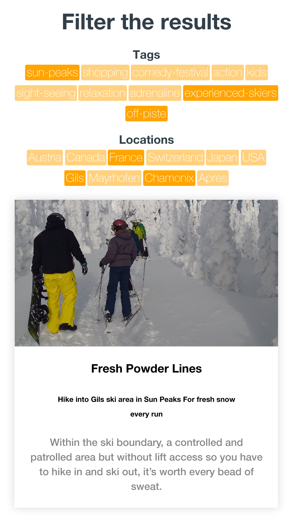
FLEXI-109: Bucket list - filters
Solution for missing content panel
The information overlay is in a div hidden below the image with a class of "content". This has an inline style of style="bottom: -###px;" which is then removed when a filter is applied. This either needs adding into the main stylesheet, or a separate class creating which can be applied to the element.
Code:
<div class="content" style="bottom: -423px;">
Solution for filters
When a filter is selected its tag appears in the select box. Using css, a close icon can be applied to each filter tag, and by adding an event listener to the click it can be directed to the existing function to remove the filter.
The issue here is that the filters appear in the select box; which means tryig to click there will only open select box. It would be better if the chosen filter tags appeared below the select box where they csan be interacted with.
$("main").on("click", "button[data-wish-list-remove]", function(t) {
        t.preventDefault();
        var i = $(this).data("wish-list-remove");
        n("remove", i)
    });
FLEXI-128: Top Nav
Solution
The gap at the bottom of the navbar causes the mouse to exit the menu unless it's exactly lined up with the css upwards-pointing arrow. Simply remove the gap to prevent this from happening by moving the menu down a couple of pixels:.
The font size is simply too big for mobiles; I have found this to be a common problem with iPhones that typically display text bigger than their android counterparts. This needs to be applied for the mobile phone breakpoint css only.
Simply add scroll ability to the menu divs. Initially considered reducing element count and spacing, but this would affect usability and there's no way to account for all phone screens. Set the background declaration for the second level menu to be the Flexiski blue-grey.
Old code:
@media(max-width:1100){
	#Navigation.nav-active ul.primary{
		right: 5%;
	}
	#Navigation li ul.level-2{
		position: absolute;
		left: 100%;
		height: 100%;
		min-height: 100%;
		top: 0;
		padding: 30px;
		-webkit-transition: all 0.3s ease;
		-moz-transition: all 0.3s ease;
		-ms-transition: all 0.3s ease;
		-o-transition: all 0.3s ease;
		transition: all 0.3s ease;
		z-index: 2;
		width: 100%;
		background: #3c3c3b;
	}
}
New code:
@media(max-width:1100){
	#Navigation.nav-active ul.primary{
		right: 5%;
		overflow-y: scroll;
	}
	#Navigation li ul.level-2{
		position: absolute;
		left: 100%;
		height: 100%;
		min-height: 100%;
		top: 0;
		padding: 30px;
		-webkit-transition: all 0.3s ease;
		-moz-transition: all 0.3s ease;
		-ms-transition: all 0.3s ease;
		-o-transition: all 0.3s ease;
		transition: all 0.3s ease;
		z-index: 2;
		width: 100%;
		background: #323f48;
	}
}
FLEXI-140: Video grey holding image
Solution
I suggest this is down to missing images; it defaults to youtube's default placeholder image, but on other pages there is the correct Flexiski background image in place. The style is inline on the video-wrap div containing the video.
Code:
div class="video-wrap" style="background: url(//img.youtube.com/vi/yoRIb64aXZI/maxresdefault.jpg) center center no-repeat; background-size: cover;"
Key component:
style="background: url(//img.youtube.com/vi/yoRIb64aXZI/maxresdefault.jpg)
FLEXI-141: Footer
Solution
I would suggest only at the biggest breakpoint does the footer look slightly wrong; it works fine on mobile and tablet. When it breaks into four columns it is compromised.
FLEXI-143: Resort guide - staff member background
Cannot replicate - please can you provide a screenshot?
FLEXI-146: Blog - mobile text wrapping
Solution
The latest news div has a huge negative top margin which pushes it right up against the base of the blog. The text has a set width of 100%; removing this and replacing it with a padding value will match it up with the text at the start of the blog which is in a different div container. "films leave the holding image behind" - I have been through all blogs and can't find any videos in relation to this issue?
FLEXI-149: Mobile accommodation page - trip advisor
Solved - duplicate of bug 150
FLEXI-156: Bucket List - buggy
Suggestion
I think there is too much interactivity on this page; too much animation, too much reveal and hide. There is not enough content on each result to warrant it. I think it would be better to have the content for each post right there on the page under the image, perhaps crop the images to a widescreen ratio to reduce the vertical height, or a square ratio at least. I would also remove the double drop down filter boxes and replace with static filter toggle buttons.
Solution
Remove country names and locations from "tags" list and place all in the second drop-down "countries" but rename it "locations".
FLEXI-157: All destination - can't click & other issues
Solution
See FLEXI-138 for how to fix the mobile menu scroll.
After clicking "See all Destinations" and then choosing "VIEW RESORTS" the new content is dynamically loaded in, so scrolling down the menu also scrolls the page which the new content is loaded into at the top. Javascript is needed to move to the top of the page after clicking the link.
Regarding " OR shows you a resort view where the CTA text doesn't fit in the box and there's suddenly a scroller and everythings squeezed over to the left" - I have not replicated this yet.
Wishlist link exists but has no heart icon - has secondary text instead. has the client missed this or do they want the icon showing as per the desktop menu?
FLEXI-159: Newsletter sign up
Solution
Adding a top border to match the footer colour is a simple way to create space and contrast.
This select box doesn't actually work; I suggest replacing it with the design element used one level higher on the site on the destination page. Is there a reason this wasn't done in the first place?
Spacing reduced between elements and Trip Advisor image hidden.
Regarding "Overview features should be displayed in one line without the need to scroll" - this will require a rewrite of the code to remove javascript functionality. A simple list will meet the client's request; however I would recommend it is a vertical list rather than a horizontal one, which then makes the page even longer. Perhaps they will be satisfied with just the reduction of space from the other areas as detailed below.